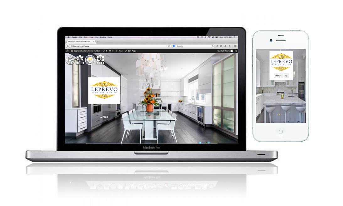
I recently had an existing client of mine, Leprevo Custom Homes, request a mobile site added to their existing website. Although we created their site about a year ago, the client chose to skip a responsive version to be included in their original development. Doing so after the fact can result in having to setup a new design that is fully responsive or a mobile version (a new design just for mobile and smartphones), and is more costly in the long run.
What is a responsive design, you might be asking?
Well, Responsive web design is a web design approach aimed at crafting sites to provide an optimal viewing experience—easy reading and navigation with a minimum of resizing, panning, and scrolling—across a wide range of devices (from mobile phones to desktop computer monitors). This means that a site is created to look great in every screen width (from desktops to tablets and mobile phones (in both landscape and portrait mode).
Responsive is definitely the future of web design and is an important aspect to consider if you are just starting to plan your business or personal website. More and more people these days are researching businesses or browsing for anything on devices other than a desktop computer. Here are some facts to consider:
- In 2014, mobile users surpassed desktop users, and mobile traffic now accounts for over 16% of all web traffic
- 69% of tablet users have shopped via their template in the last 30 days.
- According to a Google survey, 48% of users said that if a site didn’t work well on their smartphone, it made them feel like the company didn’t care about their business.
For Leprevo Custom Homes, we opted to just create a separate mobile site that reflected the desktop site’s current design. This makes the site look great for mobile phone users (and the original version displays best for desktop computer users), but leaves tablet users out in the cold.
In creating this mobile version, we just made it easier for more people to engage with the website and, therfore, get more people engaging in your business.
Here is the final versions of the leprevo.com mobile site. To see it in action, click this link from your smartphone or mobile device. http://www.leprevo.ca.
Sources:
http://www.businessinsider.com/mobile-will-eclipse-desktop-by-2014-2012-6
http://www.inmobi.com/inmobiblog/2012/5/11/inmobi-and-mobtext-launch-brand-new-consumer-research-the-role-of-tablets-in-the-consumer-sales-journey/
http://www.google.com/think/infographics/multi-screen-world-infographic.html


0 Comments